Brightening Up
The house felt heavy, but an inspired renovation breathed new light into the interior and proved that, with good design, you really can defy gravity.
Design by Michael Mariotti and Faith Hochman
Photography by Ariel Camilo
She wanted to stay. He was ready to go. The couple had raised a family in their Mahwah home, and as empty nesters, they were looking for a house that worked for this new phase of their lives. Enter designer Michael Mariotti of Michael Mariotti Interior Design in Haworth, who’d collaborated with them on previous renovations. His plan for a light-washed, open-plan main floor, along with an updated chef’s kitchen for her and a luxurious master bathroom for him, persuaded both of them that staying put could be exactly the change they were hoping for
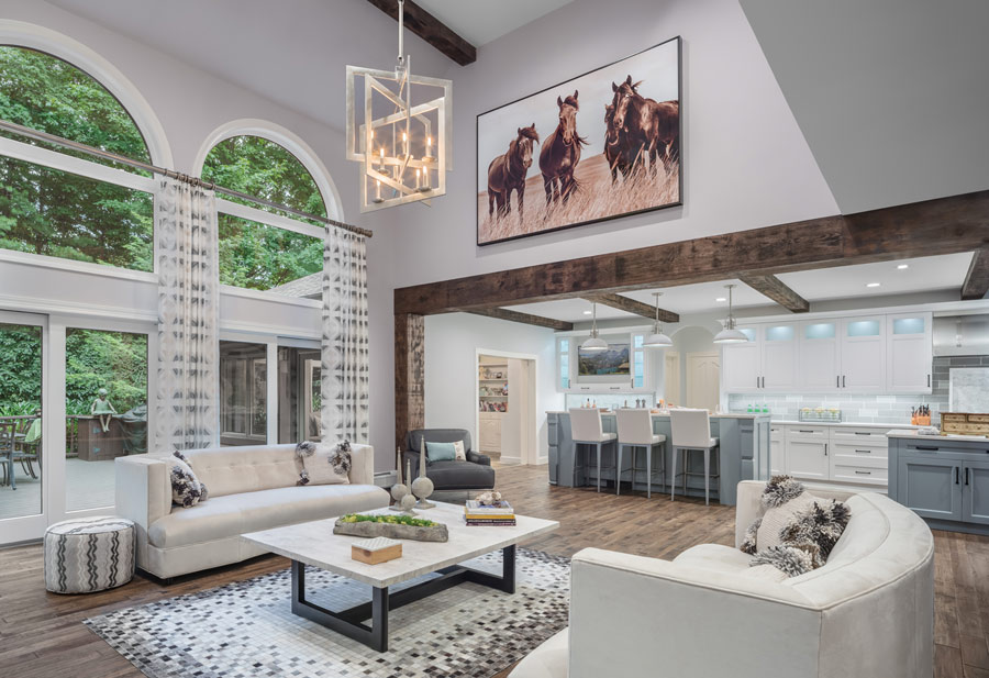
Before the renovation, faux finishes, ornate draperies and formal furnishings made the main floor feel heavy and dark. Mariotti removed the wall that separated the kitchen from the great room and, to warm up the now-open interior, installed rough-hewn wooden beams on the ceilings and around various entryways. “I wanted to juxtapose something a little rustic with the more sleek finishes,” he notes.
The palette in the kitchen and great room is neutral, with white predominating amid touches of gray. Two large white curved-back sofas flank a clean-lined, modern coffee table, encouraging comfort and conversation. To serve the budget, some elements were kept in place, with small design tweaks yielding maximum impact. Rather than completely refinish the fireplace, for instance, Mariotti repainted the existing fire screen, whitewashed the formerly yellow stone surround and added a dramatic rustic mantel. He kept the arched Palladian windows but stressed the vertical with a long metal curtain rod hung just below the arch. And he did away with the swag-topped curtains that conflicted with the exterior view, replacing them with airy patterned draperies. Now the room appears to flow naturally into the elegant patio and leafy backyard beyond.
The kitchen was a collaboration between Mariotti and the homeowner, a passionate cook with a bent toward organization. Even before the drawers were installed, each was designed to hold a specific item, from formal silverware and everyday flatware to food-storage containers. There are two large islands: one for storage, food prep and service, the other for informal dining. The room is filled with small touches that make a major impact, from the built-in flat-screen TV to the small coffee bar.
The previous kitchen was heavy on decorative objects; for this one, the homeowner wanted clean lines. Above the main upper cabinetry is a row of smaller backlit cabinets. Initially, Mariotti suggested using them for display, but the homeowner demurred. “No,” she told him. “Make them a frosted glass so they just glow.”
Three bathrooms—two powder rooms and the master bath—received extensive makeovers. The old master included a toilet and a bidet; a set of steps led to a large platform containing a sunken tub, across from a long vanity with double sinks. The renovated room is light and airy and functions significantly better than its predecessor. To maximize that function, Mariotti eliminated the bidet, created a true water closet, and replaced the platform with a large soaking tub. Instead of a single vanity, there are now two, separated by a mirrored makeup table
Mariotti’s greatest challenge wasn’t the design but its timing: To avoid living amid the chaos of a major renovation, the couple decided to rent a house in Arizona for two months, the idea being that, when they returned, they would move back into a nearly finished home. That plan put a fair amount of stress on the design team. “The whole renovation, from soup to nuts, was done in three months,” says Mariotti, whose team was responsible not just for the interior design but also for overseeing the entire project.
The homeowners weren’t disappointed. When they returned, virtually the entire kitchen was in place, with only the countertops remaining to be installed. They love the open, updated interior overall, though each has a favorite spot. She’s mad about the custom kitchen, and he loves soaking in the capacious tub. Each of these reactions is a tribute, in its way, to a design in which form and function perfectly intermingle.
In the newly open great room, a pair of white velvet Mitchell Gold + Bob Williams sofas with curved backs soften the angles of a large coffee table, geometric area rug and modern pendant. The room’s cool colors get a shot of warmth from rustic wood beams and hand-scraped distressed walnut flooring. The painting of horses, hung over the kitchen entryway, was commissioned by the homeowners.

Wood beams frame the kitchen entrance and complement the neutral palette on the main floor. Furnishings, like the gray leather chaise, were chosen for modern lines but also for comfort.

With its highend double oven, the kitchen was designed for serious cooking, but a custom coffee bar, tucked into a corner, invites relaxation as well. For the bar’s backsplash, the designer created a mosaic using the same glass tiles found in the main area of the kitchen.

The gray-and white palette continues in the kitchen. The massive custom island adds serious storage and an expansive serving surface.

A second island serves as an informal dining area

In one of two renovated powder rooms, the designer retained the old Chinese vanity and repainted it a matte black, adding a contemporary quartz countertop and a vessel of cast stone. In place of the formerly dark wallpaper, he installed a light-as-air floral print from York Wallcoverings.

In the master bathroom, the designer removed a drop-in tub on a bulky platform, replacing it with a large Villeroy & Boch soaking tub, and put in his-and-hers Kohler vanities and a makeup table with a large mirror. Inset in the statuary marble floor is a tile rug, also of statuary marble and bordered in black glass tile.